We use cookies (including third-party cookies), to provide you with the best possible online experience. As a global organization, we may transfer any personal information collected through cookies to other parts of the world. We may also share your personal information with third parties, including our affiliates and suppliers. For more information, please see our Privacy.
By clicking on "Reject", you reject the use of cookies that require consent.
accept
Reject
Renewal and Reconstruction, Moving Towards the Light | Austa Brand Logo New Upgrade
Delivery time: 2024-05-31
Holding the vision of Global Smart Optical Storage Integrated Solution Provider, Austa upgraded the brand logo with a fresh look. The renewed Austa extends from the presentation of the core value of the brand to the new vision and image, which is complete to show in the new era and the new starting point, and to face the opportunities and challenges with a brand new stance.
Redefinition, Renewal
Austa brand-new LOGO makes its debut, designed with the concept of "Smart Conversion, Moving Towards the Light," integrating the meaning of energy flow and transformation into the concept of sustainable iteration and innovation. The yellow dot symbolizes the conversion of solar energy into a source of energy that benefits humanity, linking to a zero-carbon future, which is also a vivid interpretation of Austa's global smart energy solutions in the zero-carbon era.
A New Chapter, Towards the Light
In the new stage of development, Austa will fully release the surging brand potential, set up an all round benchmark for the market with innovative and leading technology products, intelligent and friendly experience, and services full of temperature and care, linking the energy ecology by digital means, promoting global energy change, and embracing a zero-carbon future together.
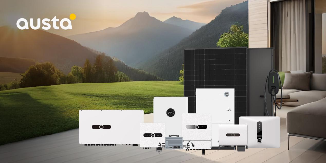
Austa is committed to the research, development, production and sales of solar inverters. We have strong R&D and production capabilities, and products are exported to 46 countries and regions including Europe, South America, Australia, Southeast Asia, and Africa. Austa upholds the mission of "Let Thousands of Households Enjoy the Green Energy", is committed to the development of integrated energy storage systems, and providing one-stop global smart energy system solutions for customers.